eof documentation
The eof function gives eigenmode maps of variability and corresponding principal component time series for spatiotemporal data analysis. This function is designed specifically for 3D matricies of data such as sea surface temperatures where dimensions 1 and 2 are spatial dimensions (e.g., lat and lon; lon and lat; x and y, etc.), and the third dimension represents different slices or snapshots of data in time.
Contents
- Syntax
- Description
- A simple example
- TUTORIAL: From raw climate reanalysis data to ENSO, PDO, etc.
- Average sea surface temperature
- Global warming
- Remove the global warming signal
- Remove seasonal cycles
- Make a gif of the seasonal cycle
- Calculate EOFs
- Optional scaling of Principal Components and EOF maps
- El Niño Southern Oscillation (ENSO) time series
- ENSO in the frequency domain
- Maps of variability
- Make a movie of SST variability from EOFs
- A note on interpreting the explained variance.
- How I got the sample data
- References
- Author Info
Syntax
eof_maps = eof(A)
eof_maps = eof(A,n)
eof_maps = eof(...,'mask',mask)
[eof_maps,pc,expvar] = eof(...)
Description
eof_maps = eof(A) calculates all modes of variability in A, where A is a 3D matrix whose first two dimensions are spatial, the third dimension is temporal, and data are assumed to be equally spaced in time. Output eof_maps have the same dimensions as A, where each map along the third dimension represents a mode of variability order of importance.
eof_maps = eof(A,n) only calculates the first n modes of variability. For large datasets, it's computationally faster to only calculate the number of modes you'll need. If n is not specified, all EOFs are calculated (one for each time slice).
eof_maps = eof(...,'mask',mask) only performs EOF analysis on the grid cells represented by ones in a logical mask whose dimensions correspond to dimensions 1 and 2 of A. This option is provided to prevent solving for things that don't need to be solved, or to let you do analysis on one region separately from another. By default, any grid cells in A which contain any NaNs are masked out.
[eof_maps,pc,expvar] = eof(...) returns the principal component time series pc whose rows each represent a different mode from 1 to n and columns correspond to time steps. For example, pc(1,:) is the time series of the first (dominant) mode of varibility. The third output expvar is the percent of variance explained by each mode. See the note below on interpreting expvar.
A simple example
Here's a quick example of how to use the eof function. Proper EOF analysis requires detrending and deseasoning the data before calculating EOFs, and those steps are described in the tutorial below, but for now let's just pretend this sample dataset is ready to be analyzed. Load the sample data, then calculate the first EOF.
Here I'm plotting the first EOF map using the cmocean delta colormap (Thyng et al., 2016) with the 'pivot' argument to ensure it's centered about zero.
% Load sample data:
load PacOcean.mat

% Calculate the first EOF of sea surface temperatures and its
% principal component time series:
[eofmap,pc] = eof(sst,1);

% Plot the first EOF map:
imagesc(lon,lat,eofmap);
axis xy image off

% Optional: Use a cmocean colormap:
cmocean('delta','pivot',0)
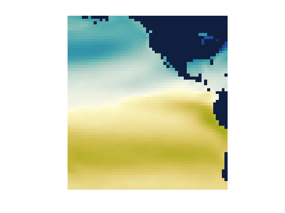
That's the first EOF of the SST dataset, but since we haven't removed the seasonal cycle, the first EOF primarily represents seasonal variability. As evidence that the pattern above is associated with the seasonal cycle, take a look at the corresponding principal component time series.
figure
plot(t,pc)
axis tight
xlim([datenum('jan 1, 1990') datenum('jan 1, 1995')])
datetick('x','keeplimits')
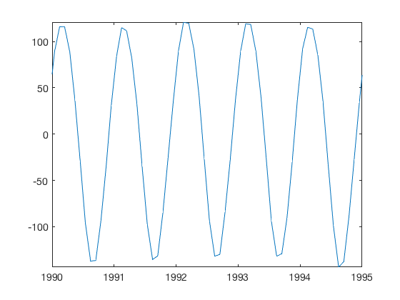
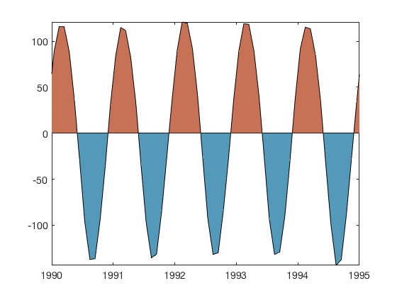
That looks pretty seasonal to me. If you prefer to plot the anomaly time series in the common two-color shaded style, use the anomaly function available on File Exchange.
anomaly(t,pc)
clear
TUTORIAL: From raw climate reanalysis data to ENSO, PDO, etc.
The eof function comes with a sample dataset called PacOcean.mat, which is a downsampled subset of the Hadley Centre's HadISST sea surface temperature dataset. At the end of this tutorial there's a section which describes how I imported the raw NetCDF data into Matlab and the process I used to subset it. If you follow along with this tutorial from top to bottom you should be able to apply EOF analysis to any similar dataset.
If you haven't already loaded the sample dataset, load it now and get an idea of its contents by checking the names and sizes of the variables:
load PacOcean.mat
whos
  Name        Size                   Bytes  Class     Attributes

  lat        60x1                      480  double
  lon        55x1                      440  double
  sst        60x55x802            21172800  double
  t         802x1                     6416  double
So we have a 3D sst matrix whose dimensions correspond to lat x lon x time. What time range, and what are the time steps, you ask? Let's take a look at the first and last date, and the average time step:
datestr(t([1 end]))
mean(diff(t))
ans =
  2×20 char array
    '15-Jan-1950 12:00:00'
    '15-Oct-2016 12:00:00'
ans =
   30.4370
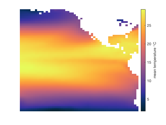
Average sea surface temperature
Okay, so this is monthly data, centered on about the 15th of each month, from 1950 to 2016. To get a sense of what the dataset looks like, display the mean temperature over that time. I'm using imagescn, which automatically makes NaN values transparent, but you can use imagesc instead. I'm also using the cmocean thermal colormap (Thyng et al., 2016):
figure
imagescn(lon,lat,mean(sst,3));
axis xy off
cb = colorbar;
ylabel(cb,' mean temperature {\circ}C ')
cmocean thermal
Global warming
Is global warming real? The trend function lets us easily get the linear trend of temperature from 1950 to 2016. Be sure to multiply the trend by 10*365.25 to convert from degrees per day to degrees per decade:
imagescn(lon,lat,10*365.25*trend(sst,t,3))
axis xy off
cb = colorbar;
ylabel(cb,' temperature trend {\circ}C per decade ')
cmocean('balance','pivot')

Remove the global warming signal
The global warming trend is interesting, but EOF analysis is all about variablity, not long-term trends, so we must remove the trend by detrend3:
sst = detrend3(sst,t);
Remove seasonal cycles
If you plot the temperature trend again, you'll see that it's all been reduced to zero, with perhaps a few eps of numerical noise. Now that's an SST dataset that even Anthony Watts would approve of.
We have now detrended the SST dataset (which also removed the mean), but it still contains quite a bit of seasonal variability that should be removed before EOF analysis because we're not interested in seasonal signals. A quick way to remove the seasonal cycle from this monthly dataset is to determine the average SST at each grid cell for any given month. Start by getting the months corresponding to each time step in t. We don't need the year or day, so I'll tilde (~) out the datevec outputs and only keep the month:
[~,month,~] = datevec(t);
The month vector is the same size as t, but only has 12 unique values:
unique(month)'
ans =
     1     2     3     4     5     6     7     8     9    10    11    12
Specifically, that means each time step is associated with one of the 12 months of the year. How many time steps are associated with January?
sum(month==1)
ans =
    67
There are 67 January SST maps in the full dataset, because it's a 67 year record. For each month of the year, we can compute an average SST map for that month by finding the indices of all the time steps associated with that month. Then remove the seasonal signal by subtracting the average of all 67 January SST maps from each January SST map. This is what I mean:
% Preallocate a 3D matrix of monthly means:
monthlymeans = nan(length(lat),length(lon),12);

% Calculate the mean of all maps corresponding to each month, and subtract
% the monthly means from the sst dataset:
for k = 1:12

   % Indices of month k:
   ind = month==k;

   % Mean SST for month k:
   monthlymeans(:,:,k) = mean(sst(:,:,ind),3);

   % Subtract the monthly mean:
   sst(:,:,ind) = bsxfun(@minus,sst(:,:,ind),monthlymeans(:,:,k));
end
I know, bsxfun is not intuitive. New versions of Matlab will let you subtract a 2D monthlymeans matrix from a 3D sst dataset by implicit expansion, meaning you can just use the minus sign instead of bsxfun, but if your version of Matlab predates 2016 you'll have to use the bsxfun method shown above.
Make a gif of the seasonal cycle
We just removed the seasonal cycle, but it was done in a loop and we didn't get to see exactly what information was being taken out of our sst dataset. So let's make a gif using my gif function:
% First frame:
figure
h = imagescn(lon,lat,monthlymeans(:,:,1));
axis xy image off
cb = colorbar;
caxis([-10 10])
cmocean balance
title(datestr(datenum(1,1,1),'mmmm'))
% Write the first frame:
gif('SeasonalTemperatureAnomalies.gif','frame',gcf,'DelayTime',0.2)
% Loop through all other frames: for k = 2:12 % Update color data: set(h,'cdata',monthlymeans(:,:,k))
   % Update title:
   title(datestr(datenum(1,k,1),'mmmm'))
   % Write this month's frame:
   gif
end

So now our sst dataset has been detrended, the mean removed, and the seasonal cycle removed. All that's left in sst are the anomalies--things that change, but are not long-term trends or short-term annual cycles. Here's the remaining variance of our sst anomaly dataset:
figure
imagescn(lon,lat,var(sst,[],3));
axis xy off
colorbar
title('variance of temperature')
colormap(jet) % jet is inexcusable except for recreating old plots
caxis([0 1])

And the map above lines up quite well with Figure 2a of Messie and Chavez (2011), which tells us we're on the right track.
Calculate EOFs
EOF analysis tells us not only where things vary, but how often, and what regions tend to vary together or out of phase with each other. With our detrended, deseasoned sst dataset, EOF analysis is this simple with the eof function:
[eof_maps,pc,expv] = eof(sst);

% Plot the first mode:
figure
imagesc(lon,lat,eof_maps(:,:,1))
axis xy image
cmocean('curl','pivot')
title 'The first EOF mode!'

Eigenvector analysis has a funny behavior that can produce EOF maps which are positive or negative, and the solutions can come up different every time using the same exact inputs. Positive and negative solutions are equally valid -- think of the modes of vibration of a drum head where some regions of the drum head go up while other regions go down, and then they switch -- and likewise the eigenvalue solutions of SST variability might be positive or negative. The only thing that matters is that when we reconstruct a time series from an EOF solution, we multiply each EOF map by its corresponding principal component (pc).
I've written the eof function to produce consistent results each time you run it with the same data, but don't worry if the sign of a solution does not match the sign of someone else's results if they used a different program to calculate EOFs--that just means their program picked the opposite-sign solution, and that's perfectly fine.
Just as EOF maps can have positive or negative solutions and both are equally valid, there's some flexibility in how the magnitudes of EOF maps are displayed. You can multiply the magnitude of an EOF map by any value you want, just as long as you divide the corresponding principal component time series by the same value. Let's take a look at the time series of the first three modes of variability:
figure
plot(t,pc(1:3,:)')
box off
axis tight
datetick('x','keeplimits')
legend('pc1','pc2','pc3')

Optional scaling of Principal Components and EOF maps
Those principal component time series are fine just the way they are, but some folks prefer to scale each time series to span a desired range. Looking at Figure 5 of Messie and Chavez (2011), it seems they chose to scale each principal component time series such that it spans the range -1 to 1. Let's do the same thing, divide each principal component time series by its maximum value and don't forget to multiply the corresponding EOF map by the same value:
for k = 1:size(pc,1)

   % Find the the maximum value in the time series of each principal component:
   [maxval,ind] = max(abs(pc(k,:)));

   % Divide the time series by its maximum value:
   pc(k,:) = pc(k,:)/maxval;

   % Multiply the corresponding EOF map:
   eof_maps(:,:,k) = eof_maps(:,:,k)*maxval;
end
El Niño Southern Oscillation (ENSO) time series
The first mode of detrended, deseasoned SSTs is assoiciated with ENSO. We can plot the time series again as a simple line plot, but anomaly plots are often filled in. Let's use anomaly to plot the first mode, and multiply by -1 to match the sign of Figure 5 of Messie and Chavez (2011).
figure('pos',[100 100 600 250])
anomaly(t,-pc(1,:),'topcolor',[1 .35 .71],'bottomcolor',[.51 .58 1]) % First principal component is enso
box off
axis tight
datetick('x','keeplimits')
text([724316 729713 736290],[.95 .99 .81],'El Nino','horiz','center')

Sure enough, some of the strongest El Nino events on record took place in 1982-1983, 1997-1998, and 2014-2016.
ENSO in the frequency domain
Sometimes we hear that El Nino has a characteristic frequency of once every five years, or five to seven years, or sometimes you hear it's every two to seven years. It's hard to see that in the time series, so we plot the first principal component in the frequency domain with plotpsd, specifying a sampling frequency of 12 samples per year, plotted on a log x axis, with x values in units of lambda (years) rather than frequency:
figure
plotpsd(pc(1,:),12,'logx','lambda')
xlabel 'periodicity (years)'
set(gca,'xtick',[1:7 33])

As you can see, the ENSO signal does not have a sharply defined resonance frequency, but there's energy in that whole two-to-seven year range. I also labeled the 33 year periodicity because that's Nyquist for this particular dataset--any energy with a longer period than Nyquist (or anywhere near it) should probably be considered junk.
Maps of variability
EOFs aren't just about time series--they're about spatial patterns of variability through time. Each mode has a characteristic pattern of variability just like the different modes of vibration of a drum head. At any given time, the different modes can be summed to create a total picture of temperature anomalies at that time. The orthogonal part of Empirical Orthogonal Function means each of the modes tend to do their own thing, independent of the other modes. Let's look at the first six modes by recreating Figure 4 of Messie and Chavez (2011) . I'm multiplying some of the modes by negative one because I want to match their signs, and remember, we're allowed to do that.
s = [-1 1 -1 1 -1 1]; % (sign multiplier to match Messie and Chavez 2011)

figure('pos',[100 100 500 700])
for k = 1:6
   subplot(3,2,k)
   imagescn(lon,lat,eof_maps(:,:,k)*s(k));
   axis xy off
   title(['Mode ',num2str(k),' (',num2str(expv(k),'%0.1f'),'%)'])
   caxis([-2 2])
end

colormap jet

The percent variance explained by each mode does match Messie and Chavez because we're using a much shorter time series than they did and we're also using a spatial subset of the world data. Nonetheless, patterns generally agree.
The jet colormap is not exactly the same one used by Messie and Chavez, which explains why some of the patterns above may look slightly different from Messie and Chavez. But since we're talking about colormaps, rainbows are actually quite bad at representing numerical data (Thyng et al, 2016). It's also a shame for science that we can't exactly replicate the plot without knowing exactly what colors were used in the published version, but I digress...
Given that these maps represent anomalies, they should be represented by a divergent colormap that gives equal weight to each side of zero. Let's set the colormaps of all the subplots in this figure to something a little more balanced:
colormap(gcf,cmocean('balance'))

Make a movie of SST variability from EOFs
At any given time, a snapshot of sea surface temperature anomalies associated with ENSO can be obtained by plotting the map of mode 1 shown above, multiplied by its corresponding principal component (the vector pc(1,:)) at that time. Similarly, you can get a picture of worldwide sea surface temperature anomalies at a given time by summing all the EOF maps, each multiplied by their corresponding principal component at that time. In this way we can build a more-and-more complete movie of SST anomalies as we include more and more more modes of variability. By the same notion, modes can be excluded to filter out undesired signals, or we can just use the first few modes as a way of filtering-out noise. Let's make a movie of the first three modes, from 1990 to 2005:
% Indices of start and end dates for the movie:
startind = find(t>=datenum('jan 1, 1990'),1,'first');
endind = find(t<=datenum('dec 31, 1999'),1,'last');
% A map of SST anomalies from first three modes at start:
map = eof_maps(:,:,1)*pc(1,startind) + ... % Mode 1, Jan 1990
eof_maps(:,:,2)*pc(2,startind) + ... % Mode 2, Jan 1990
eof_maps(:,:,3)*pc(3,startind); % Mode 3, Jan 1990% Create the first frame of the movie: figure h = imagescn(lon,lat,map); axis xy image off cb = colorbar; caxis([-2 2]) cmocean balance title(datestr(t(startind),'yyyy')) % initializes gif
gif('SSTs_1990s.gif','frame',gcf)% Loop through the remaining fames: for k = (startind+1):endind
   % Update the map for date k
   map = eof_maps(:,:,1)*pc(1,k) + ... % Mode 1
         eof_maps(:,:,2)*pc(2,k) + ... % Mode 2
         eof_maps(:,:,3)*pc(3,k);      % Mode 3
set(h,'cdata',map) caxis([-2 2]) title(datestr(t(k),'yyyy'))
   gif % adds this frame to the gif
end

The first thing you probably notice is that the 1990s SST anomaly time series is dominated by ENSO, and check out that 1997-1998 signal! No wonder it was such a hot topic in the news that year. Nonetheless, it's important to remember that the movie above is not a complete reconstruction of the SST anomalies, but rather only the first three modes, which together account for
sum(expv(1:3))
ans =
   51.8850
...just over half of the total variance of the SST dataset. To reconstruct the absolute temperature field rather than just anomalies from the first three modes, you'd need to include all the EOF maps, and you'd also have to add back in the mean SST map, the trend, and the seasonal cycle.
A note on interpreting the explained variance.
Above, we solved all 802 modes of a time series containing 802 time steps. Together, those modes explain 100% of the total variance in the sst dataset. That means we could add all those 802 modes together, multiplied by their principal components, and fully reconstruct the time series without any lost information. See, the sum of the explained variance...
sum(expv)
ans =
  100.0000
...is 100 percent. For this dataset and most other real-world datasets with natural modes of variability, the first few modes will carry most of the information and everything else should probably be ignored. Sometimes it is insightful to the explained variance as a function of mode number, or as is also common, the cumulative explained variance. Let's plot both:
figure
subplot(2,1,1)
plot(expv)
axis([0 802 0 37])
box off
ylabel 'variance explained per mode'

subplot(2,1,2)
plot(cumsum(expv))
axis([0 802 0 100])
ylabel 'cumulative variance explained'
xlabel 'mode number'
box off

The plots above indicate that the first three modes account for more than half the variance in the detrended, deseasoned SST dataset, and everything else just adds tiny incremental improvements that get us just a little bit closer to reconstructing the full original dataset.
As a general rule of thumb, I tend to think of anything past about the third or fifth mode to be somewhat of a Rorschach test that might trick you into believing there's meaningful signal, but be careful with trying to interpret those Nth order modes--Even in this simple dataset, there are 802 modes, meaning there's probably at least one mode in there that can seem to explain just about any crazy theory you might have. In other words, be mindful of the potential for p-hacking when interpreting EOFs.
Most of the 802 modes we solved for in the example above, each contribute a very small amount to the overall SST variability and are probably physically meaningless, so there's no sense in using so much computer power to solve for all those modes. If your dataset is very large, it will be much faster and will use less memory to solve for just the modes you need. There's only one small catch...
% Solve all modes:
[eof_maps_all,pc_all,expv_all] = eof(sst);

% Solve for just the first 10 modes:
[eof_maps_10,pc_10,expv_10] = eof(sst,10);
We've just solved for the first 10 modes, and we see that the EOF maps and the principal component time series are on agreement with the solutions obtained by solving all 802 modes:
figure
subplot(1,2,1)
imagesc(eof_maps_all(:,:,1)-eof_maps_10(:,:,1))
colorbar
cmocean('balance','pivot')

subplot(1,2,2)
plot(pc_all(1,:)-pc_10(1,:))
axis tight

Both plots above show purely numerical noise. There is some apparent structure to them, but check out the cale of the color axis on the left (10^-17) and the y axis on the right (10^-14). That's rounding error which results from the fact that Matlab digitizes the numbers it works on, and it's common for the magnitude of rounding errors to track the magnitudes of the numbers that are being rounded.
So although there's a little bit of numerical noise, the solutions when solving for all 802 modes are the same as the solutions when solving for just 10 modes. Great. Until we look into the explained variance:
figure
plot(expv_all(1:10),expv_10,'o')
hold on
plot([0 50],[0 50]) % straight line (both values equal)
axis equal
xlabel 'explained variance (all 802 solutions')
ylabel 'explained variance (10 solutions')

The explained variances do not match, because expv provides a measure of percentage of variance of the modes that were solved in a given run. That is, if we solve for all 802 modes, the sum of the variance explained by the first 10 modes will not equal 100%:
sum(expv_all(1:10))
ans =
   73.4559
However, since we only solved the first 10 modes to get expv_10, their sums will equal 100%
sum(expv_10(1:10))
ans =
  100.0000
because those 10 modes explain 100% of the variance related to those 10 modes. That's somewhat circular logic, I know, so what good are the values of explained variance if you're only solving for a few modes? Maybe they aren't that good at all. The best thing you can do is use a long time series, solve for all the modes, and then look at the explained variances to see where they asymptote.
If you can only solve for a few modes due to computational limitations, you can still get some sense of whether you've gotten the full picture by plotting the cumulative sum of the explained variance from whatever modes you did solve for:
figure
plot(cumsum(expv_10),'o-')
xlabel 'mode number'
ylabel 'cumulative sum of explained variance (%)'

Of course the final value on that plot is 100% (which we know really means 100% of about 73.5% for this dataset), so the 100% value doesn't tell us much on its own, although we can see that it clearly doesn't reach much of an asymptote before getting to 100%, indicating that there's more to the story...
Sorry I don't have a tidier solution to that issue right now, but hopefully this little explainer gives a better understanding of what the eof function can and can't tell you.
How I got the sample data
The example dataset shown above comes from the Hadley Center HadISST, found here (Rayner et al., 2003) which in full exceeds 200 MB. If you'd like to perform the the same kind of analysis on a different region of the world, you can download the HadISST_sst.nc dataset and import it into Matlab like this. Downsampling or subsetting the dataset are up to you:
% Load the full SST dataset:
lat = double(ncread('HadISST_sst.nc','latitude'));
lon = double(ncread('HadISST_sst.nc','longitude'));
t = double(ncread('HadISST_sst.nc','time')+datenum(1870,1,0));
sst = ncread('HadISST_sst.nc','sst');
% To quarter the size of the sample dataset, I crudely downsample to every other grid point: sst = sst(1:2:end,1:2:end,:); lat = lat(1:2:end); lon = lon(1:2:end);
% To further reduce size, I clipped to a range of lats and lons and kept only post-1950 data:
rows = lon<-70;
lon = lon(rows);
cols = lat>=-60 & lat<=60;
lat = lat(cols);
times = t>=datenum('jan 1, 1950');
t = t(times);
sst = sst(rows,cols,times);
sst(sst<-50) = NaN;
% I find it easier to rearrange as lat x lon x time: sst = permute(sst,[2 1 3]);
% Save the sample data:
save('PacOcean.mat','lat','lon','t','sst')
References
Messié, Monique, and Francisco Chavez. "Global modes of sea surface temperature variability in relation to regional climate indices." Journal of Climate 24.16 (2011): 4314-4331. doi:10.1175/2011JCLI3941.1.
Rayner, N. A., Parker, D. E., Horton, E. B., Folland, C. K., Alexander, L. V., Rowell, D. P., Kent, E. C., Kaplan, A. (2003). Global analyses of sea surface temperature, sea ice, and night marine air temperature since the late nineteenth century. J. Geophys. Res.Vol. 108, No. D14, 4407 doi:10.1029/2002JD002670.
Thyng, K.M., C.A. Greene, R.D. Hetland, H.M. Zimmerle, and S.F. DiMarco. 2016. True colors of oceanography: Guidelines for effective and accurate colormap selection. Oceanography 29(3):9-13, doi:10.5670/oceanog.2016.66.
Author Info
The eof function was written by Chad A. Greene of the University of Texas Institute for Geophysics (UTIG) in January 2017, but leans heavily on Guillame MAZE's caleof function from his PCATool contribution. This tutorial was written by Chad Greene with help from Kaustubh Thirumalai.